Designing A Home Brew Label
Designing your own home brew labels can be a really great way to add value to your home brewed beers. A few years ago when I got married I gave everyone who attended the wedding a couple of different beers. The beers were a Citra Pale Ale and a Maibock, I designed the beer labels and themed them around the wedding and thanked each person for attending all on the beer label.
On occasions like these designing a home brew label make the beer that bit more special. Labeling beers isn’t something I do all the time. If I’m just drinking the home brew myself or sharing with a few friends I label the caps. This means I don’t have to remove the labels from the bottles when I reuse them. If you are giving away the bottles though a label can give someone an impression of the beer before they even drink it.
Beer Label Design Process
I think if someone gets given a bottle of home brew with a label on that complements the style of beer it can alter their perceptions of what it’s going to taste like. Having this in mind I designed a label for a home brew Saison and have detailed the process here. I’m by no means an artistic person in a graphical design sense but I do like the flow of doing something like this.
The good thing about labeling home brew is you can add as much or as little detail as you like. You don’t have to meet any requirements or standards because the beer is going to be sold. This means you can come up with something as unique as you like or try to replicate your favourite beer labels, it’s up to you. This tutorial is to design this label for my Saison:
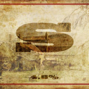
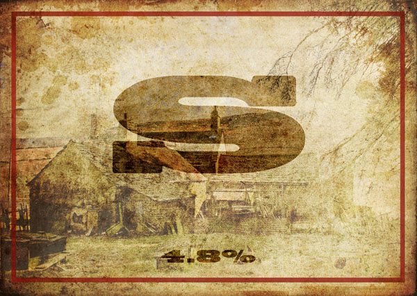
So this is what I came up with, now I have to admit there isn’t much to it and it is fairly simple Most of the time my home brew doesn’t get named, I usually just write on the cap a letter or number combination to signify what it is. For this reason this Saison is named S.
I don’t want to have to tell people what the beer tastes like or what flavours are present on the label. These kinds of things are necessary for commercial beer but not for home brew, that’s for the drinker to decide.
The only thing I had in mind was that is was a Farmhouse style beer and I wanted the label to look fairly rustic with a modern twist.
I am by no means a graphic design wizard so here are the steps I took to create this label. I used Photoshop but I am sure you can do the same thing in the open source free software GIMP.
Home Brew Label Tutorial
First of all I created a new document roughly the size of the label you want, as long as it’s bigger than necessary you can scale it down later.
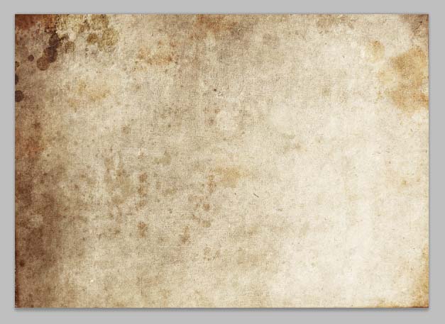
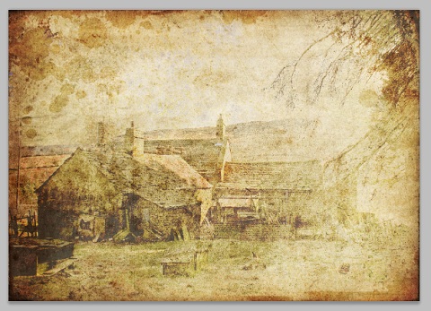
I then grabbed a grungy texture from DeviantArt and resized it to my canvas.
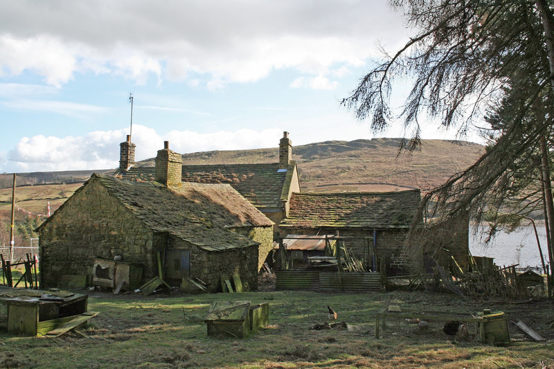
On top of this I created another layer of a sort of farm scene I found here which wasn’t really intended to be a focal point but was good enough to add a bit of interest to the whole thing.
I then set the layer properties to Vivid light and altered the Opacity as follows:
To end up with this
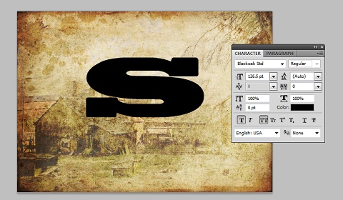
5. Next up was to the dubious name “S”. Using the font Blackoak std and the colour black, I centred this in the foreground like so.
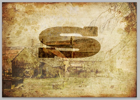
6. This type layer was then duplicated and set the blending modes of both layers set to Soft Light, to achieve the following:
7. The same process was then used to add the ABV%
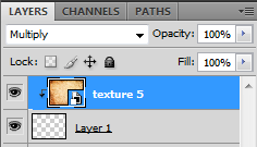
8. The last thing I decided to do was add a border to the whole thing to frame it nicely, I created a rectangle and cut away the centre. I then added another texture to the border to tie everything in using the following settings.
The final label:
Overall i’m fairly pleased with the label and think it complements the style of beer, like anything though I guess it’s a subjective thing. At least it’s slightly better than giving someone a few bottles with a letter scribbled on the bottle cap in permanent marker.



Leave a Reply
Want to join the discussion?Feel free to contribute!